library(mlbgameday)
library(magrittr)
library(ggplot2)
library(dplyr)
##
## Attaching package: 'dplyr'## The following objects are masked from 'package:stats':
##
## filter, lag## The following objects are masked from 'package:base':
##
## intersect, setdiff, setequal, unionPitches from PITCHf/x have a feature called nasty
that somehow estimates the nastiness of a pitch.
https://tht.fangraphs.com/tht-live/gameday-pitchf-x-changes-for-2010/
gives a short description of it.
The “nasty” field is presumably a crude attempt to calculate how hard to hit a particular pitch was, on a scale of 0-100. My initial cursory look at the data indicates that they are calculating the “nasty” factor mostly based on the location of the pitch, a linear calculation of how close it is to the edges and away from the heart of the zone. For the fastball, MLBAM does not appear to be including anything related to the movement or speed of the pitch into the “nasty” factor. For the curveball, they appear to be rating sweeping curveballs as significantly more nasty than 12-to-6 curveballs. Anyway, I’m not sure that any of this matters as more than a curiosity. As a sabermetric community we have much better approaches available for measuring the nastiness of a pitch.
I’m going to take a look at it to see what I can get from it.
# Takes hours to get all the data for the year
dat <- get_payload(start = "2018-01-01", end = "2018-12-31")
Get pitcher names from at bat data.
d2 <- inner_join(dat$pitch, dat$atbat, by=c("num", "url"))Let’s look at nasty.
d2$nasty %>% summary## Min. 1st Qu. Median Mean 3rd Qu. Max. NA's
## 0.00 28.00 40.00 40.17 51.00 100.00 67971d2$nasty %>% is.na %>% summary## Mode FALSE TRUE
## logical 744738 67971Almost 10% of values are NA. I’ll remove them.
d3 <- d2 %>% filter(!is.na(nasty))d3 %>% {hist(.$nasty)}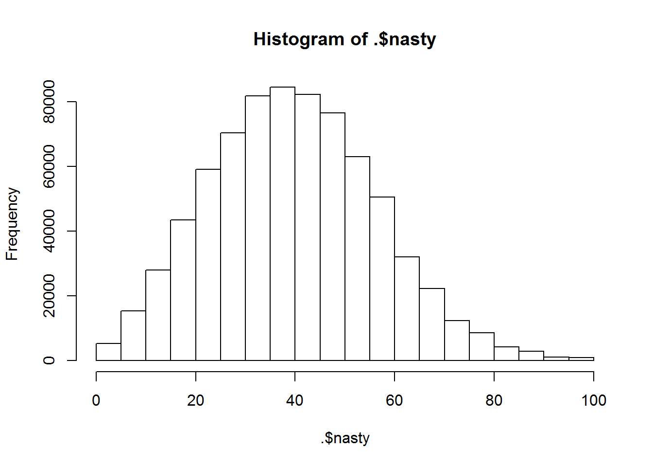
Let’s plot this as a function of the pitch location.
ggplot(d3) + stat_summary_2d(aes(px, pz, z=nasty), bins=250) + scale_fill_gradientn(colors=c('blue', 'yellow', 'red'))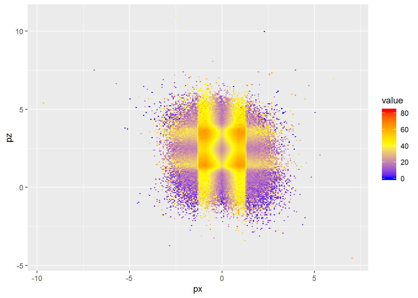
It’s clear that pitch location has a huge effect on the nasty value. It looks poorly made with the edges of the strike zone in each direction extending into the ball range. Pitches just outside the strict strikezone are also likely to be called strikes, so it doesn’t really make sense.
How does it vary over pitches?
ggplot(d3 %>% group_by(pitch_type) %>% mutate(ntype=n()) %>% ungroup %>% filter(ntype>1000)) + stat_summary_2d(aes(px, pz, z=nasty), bins=50) + scale_fill_gradientn(colors=c('blue', 'yellow', 'red')) + facet_wrap(. ~ pitch_type)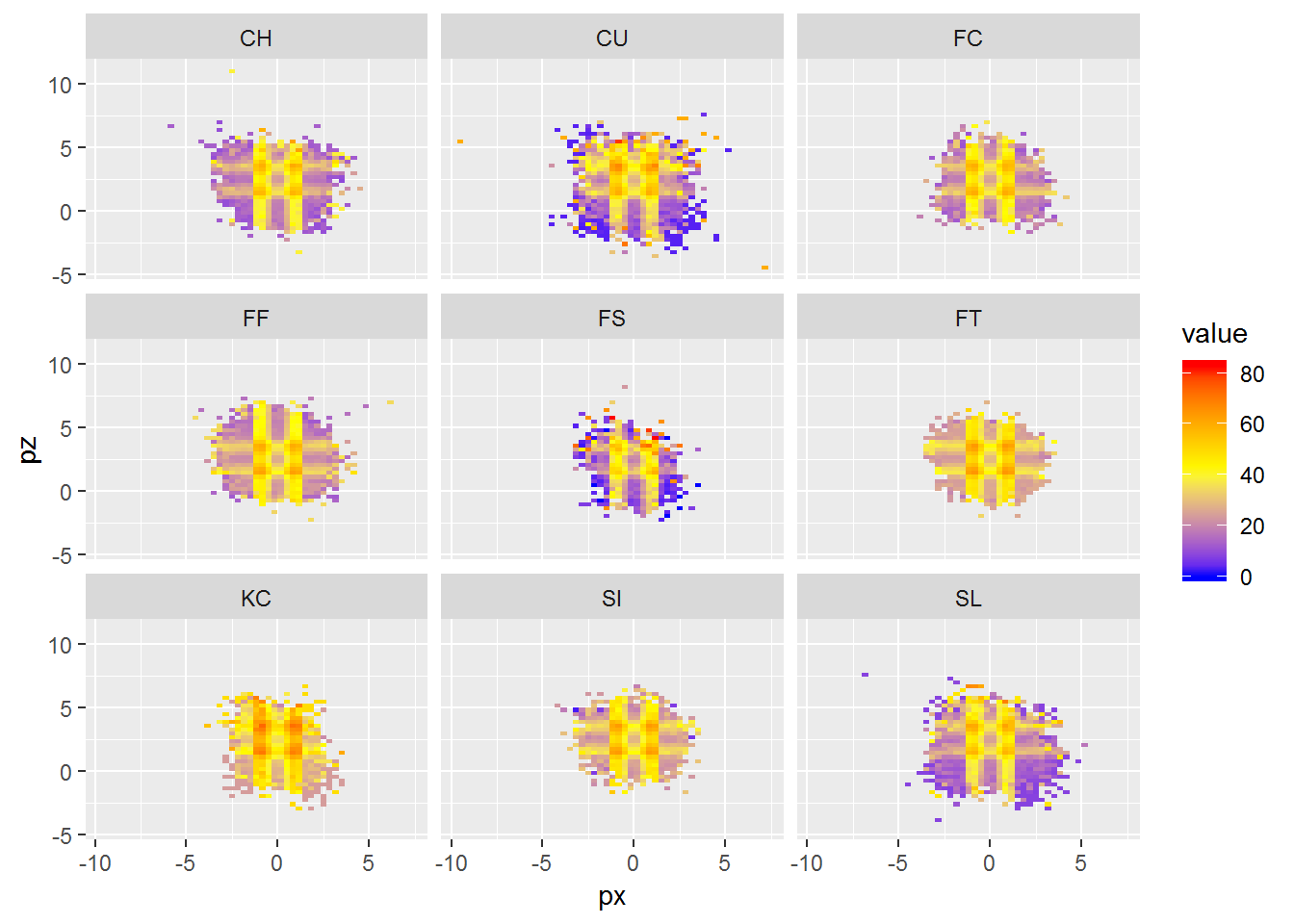
Looks like no difference.
How about looking at velocity and break for each pitch?
ggplot(d3 %>% group_by(pitch_type) %>% mutate(ntype=n()) %>% ungroup %>% filter(ntype>1000)) + stat_summary_2d(aes(start_speed, break_length, z=nasty), bins=50) + scale_fill_gradientn(colors=c('blue', 'yellow', 'red')) + facet_wrap(. ~ pitch_type)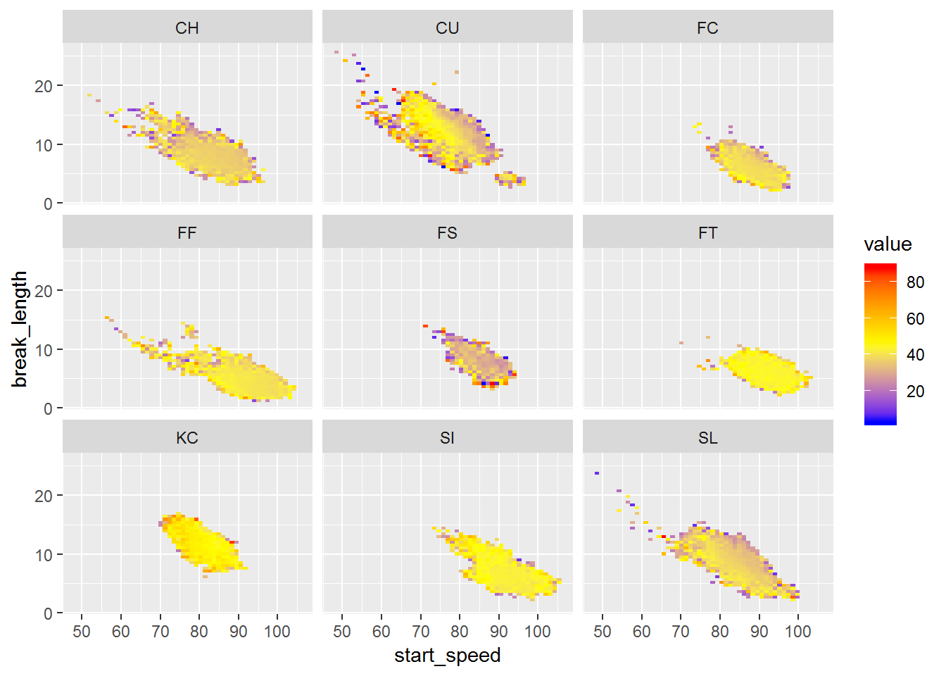
No clear patterns here.
How about the result of the play? Were balls less nasty? They should be based on the zones we saw.
ggplot(d3) + stat_summary_2d(aes(px, pz, z=nasty), bins=250) + scale_fill_gradientn(colors=c('blue', 'yellow', 'red')) + facet_grid(. ~ type)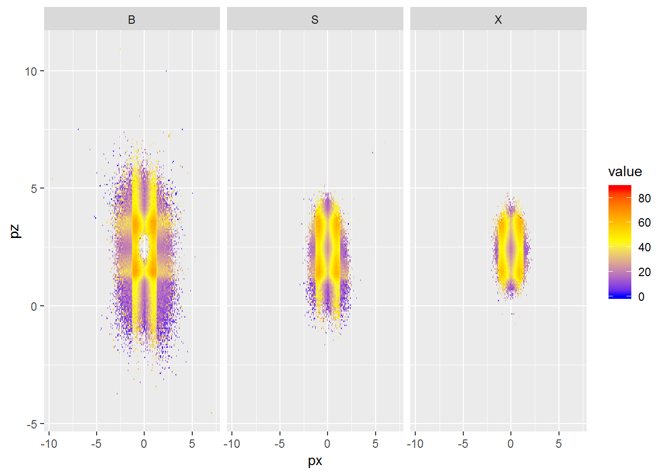
Exactly as expected, not sure why I bothered.
Conclusion
So it looks like the nasty measure is pretty useless. A pitch just outside the strike zone, which will often be called or strike, or be difficult to make solid contact on, is given a low nasty score. It seems to be almost entirely based on the pitch location.