Recently I was reading about pitchers having no control over results of a ball in play. This is the main idea behind FIP/DIPS. This goes against the common idea that pitchers can be good if they induce weak contact. I’m going to investigate this in this post.
Similar to last time, I’m using the same data from mlbgameday.
library(mlbgameday)
library(magrittr)
library(ggplot2)
library(dplyr)
##
## Attaching package: 'dplyr'## The following objects are masked from 'package:stats':
##
## filter, lag## The following objects are masked from 'package:base':
##
## intersect, setdiff, setequal, unionGet data.
# Takes hours to get all the data for the year
dat <- get_payload(start = "2018-01-01", end = "2018-12-31")
Get pitcher names from at bat data.
play_guid is included since we
only want the final pitch of each at bat, not every pitch.
d2 <- inner_join(dat$pitch, dat$atbat, by=c("num", "url", "play_guid"))View all at bat outcomes.
d2$event %>% table## .
## Batter Interference Bunt Groundout Bunt Lineout
## 58 349 11
## Bunt Pop Out Catcher Interference Double
## 150 53 10372
## Double Play Fan interference Field Error
## 602 39 2166
## Fielders Choice Fielders Choice Out Flyout
## 127 390 25867
## Forceout Grounded Into DP Groundout
## 4438 4277 40187
## Hit By Pitch Home Run Intent Walk
## 2423 9136 3393
## Lineout Pop Out Runner Out
## 12900 10874 391
## Sac Bunt Sac Fly Sac Fly DP
## 911 1600 17
## Sacrifice Bunt DP Single Strikeout
## 1 32733 65614
## Strikeout - DP Triple Triple Play
## 263 1152 4
## Walk
## 27066The equation for BABIP is
$BABIP = $
Essentially we have non-homerun hits over non-homerun hits plus outs from balls in play. We need to find these two categories from the data.
inplayhits <- c("Double", "Single", "Triple")
inplayouts <- c("Bunt Groundout", "Bunt Lineout", "Bunt Pop Out", "Double Play", "Field Error", "Fielders Choice", "Fielders Choice Out", "Flyout", "Forceout", "Grounded Into DP", "Groundout", "Lineout", "Pop Out", "Triple Play")
To make sure I didn’t miss any, I’ll check the ones not in any of these.
d2 %>% filter(!(event %in% c(inplayhits, inplayouts))) %>% .$event %>% table## .
## Batter Interference Catcher Interference Fan interference
## 58 53 39
## Hit By Pitch Home Run Intent Walk
## 2423 9136 3393
## Runner Out Sac Bunt Sac Fly
## 391 911 1600
## Sac Fly DP Sacrifice Bunt DP Strikeout
## 17 1 65614
## Strikeout - DP Walk
## 263 27066Now we have our inplay data.
inplay <- d2 %>% filter(event %in% c(inplayhits, inplayouts))We can find the league-wide BABIP, which I think should be around .300.
sum(inplay$event %in% inplayhits) / nrow(inplay)## [1] 0.3018916Wow, that was really close and I hadn’t checked it beforehand.
Now we want to see how many pitchers can control this value.
First we’ll check the distribution over all pitchers above a certain number of in play at bats.
d2 %>% group_by(pitcher_name) %>% summarize(ipo=sum(event %in% inplayouts), iph=sum(event %in% inplayhits), N=iph+ipo, BABIP=iph/(iph+ipo)) %>% filter(N>100) %>% arrange(BABIP)## # A tibble: 422 x 5
## pitcher_name ipo iph N BABIP
## <chr> <int> <int> <int> <dbl>
## 1 Jose Leclerc 109 26 135 0.193
## 2 Josh Fields 93 24 117 0.205
## 3 Sean Doolittle 96 25 121 0.207
## 4 Shawn Kelley 118 32 150 0.213
## 5 Pedro Strop 131 36 167 0.216
## 6 Steve Cishek 152 42 194 0.216
## 7 Kenley Jansen 159 44 203 0.217
## 8 Diego Castillo 111 31 142 0.218
## 9 Julio Teheran 397 113 510 0.222
## 10 Kyle Barraclough 115 33 148 0.223
## # ... with 412 more rowsWe can see that the pitchers with lowest BABIP are mostly relievers, either because they are better or small sample size.
In looking through the data, I found an error: spring training data has been included.
d2 %>% filter(pitcher_name=="Rex Brothers") %>% .$date## [1] 2018-02-23 2018-02-23 2018-02-23 2018-02-23 2018-02-23 2018-02-23
## [7] 2018-02-23 2018-02-26 2018-02-26 2018-02-26 2018-02-26 2018-02-26
## [13] 2018-02-26 2018-02-26 2018-02-26 2018-03-01 2018-03-01 2018-03-01
## [19] 2018-03-01 2018-03-01 2018-03-01 2018-03-01 2018-03-01 2018-03-05
## [25] 2018-03-05 2018-03-05 2018-03-05 2018-03-05 2018-03-05 2018-03-05
## [31] 2018-03-05 2018-03-05 2018-03-05 2018-03-05 2018-03-05 2018-03-05
## [37] 2018-03-05 2018-03-05 2018-03-05 2018-03-05 2018-03-05 2018-03-05
## [43] 2018-03-05 2018-03-05 2018-03-09 2018-03-09 2018-03-09 2018-03-09
## [49] 2018-03-09 2018-03-13 2018-03-13 2018-03-13 2018-03-13 2018-03-13
## [55] 2018-03-13 2018-03-13 2018-03-13 2018-03-13 2018-03-13 2018-03-13
## [61] 2018-03-13 2018-03-13 2018-03-13 2018-03-13 2018-03-16 2018-03-16
## [67] 2018-03-16 2018-03-16 2018-03-16 2018-03-16 2018-03-16 2018-03-16
## [73] 2018-03-16 2018-03-16 2018-03-16 2018-03-16 2018-03-16 2018-03-16
## [79] 2018-03-22 2018-03-22 2018-03-22 2018-03-22 2018-03-22 2018-03-22
## [85] 2018-03-22 2018-03-22 2018-03-22 2018-03-22 2018-03-22 2018-03-24
## [91] 2018-03-24 2018-03-24 2018-03-24 2018-03-24 2018-03-24 2018-03-24
## [97] 2018-03-24 2018-03-24 2018-03-26 2018-03-26 2018-03-26 2018-03-29
## [103] 2018-03-29
## 242 Levels: 2018-02-21 2018-02-22 2018-02-23 2018-02-24 ... 2018-10-28I don’t see an easy way to filter out spring training games. (There is when collecting the data, but not after getting it.) I’ll just filter out all the dates up through March, which will cut off a little of the regular season.
d2 <- d2 %>% filter(as.character(date) >= "2018-04-01")
d2$date %>% unique
## [1] 2018-04-01 2018-04-02 2018-04-03 2018-04-04 2018-04-05 2018-04-06
## [7] 2018-04-07 2018-04-08 2018-04-09 2018-04-10 2018-04-11 2018-04-12
## [13] 2018-04-13 2018-04-14 2018-04-15 2018-04-16 2018-04-17 2018-04-18
## [19] 2018-04-19 2018-04-20 2018-04-21 2018-04-22 2018-04-23 2018-04-24
## [25] 2018-04-25 2018-04-26 2018-04-27 2018-04-28 2018-04-29 2018-04-30
## [31] 2018-05-01 2018-05-02 2018-05-03 2018-05-04 2018-05-05 2018-05-06
## [37] 2018-05-07 2018-05-08 2018-05-09 2018-05-10 2018-05-11 2018-05-12
## [43] 2018-05-13 2018-05-14 2018-05-15 2018-05-16 2018-05-17 2018-05-18
## [49] 2018-05-19 2018-05-20 2018-05-21 2018-05-22 2018-05-23 2018-05-24
## [55] 2018-05-25 2018-05-26 2018-05-27 2018-05-28 2018-05-29 2018-05-30
## [61] 2018-05-31 2018-06-01 2018-06-02 2018-06-03 2018-06-04 2018-06-05
## [67] 2018-06-06 2018-06-07 2018-06-08 2018-06-09 2018-06-10 2018-06-11
## [73] 2018-06-12 2018-06-13 2018-06-14 2018-06-15 2018-06-16 2018-06-17
## [79] 2018-06-18 2018-06-19 2018-06-20 2018-06-21 2018-06-22 2018-06-23
## [85] 2018-06-24 2018-06-25 2018-06-26 2018-06-27 2018-06-28 2018-06-29
## [91] 2018-06-30 2018-07-01 2018-07-02 2018-07-03 2018-07-04 2018-07-05
## [97] 2018-07-06 2018-07-07 2018-07-08 2018-07-09 2018-07-10 2018-07-11
## [103] 2018-07-12 2018-07-13 2018-07-14 2018-07-15 2018-07-17 2018-07-19
## [109] 2018-07-20 2018-07-21 2018-07-22 2018-07-23 2018-07-24 2018-07-25
## [115] 2018-07-26 2018-07-27 2018-07-28 2018-07-29 2018-07-30 2018-07-31
## [121] 2018-08-01 2018-08-02 2018-08-03 2018-08-04 2018-08-05 2018-08-06
## [127] 2018-08-07 2018-08-08 2018-08-09 2018-08-10 2018-08-11 2018-08-12
## [133] 2018-08-13 2018-08-14 2018-08-15 2018-08-16 2018-08-17 2018-08-18
## [139] 2018-08-19 2018-08-20 2018-08-21 2018-08-22 2018-08-23 2018-08-24
## [145] 2018-08-25 2018-08-26 2018-08-27 2018-08-28 2018-08-29 2018-08-30
## [151] 2018-08-31 2018-09-01 2018-09-02 2018-09-03 2018-09-04 2018-09-05
## [157] 2018-09-06 2018-09-07 2018-09-08 2018-09-09 2018-09-10 2018-09-11
## [163] 2018-09-12 2018-09-13 2018-09-14 2018-09-15 2018-09-16 2018-09-17
## [169] 2018-09-18 2018-09-19 2018-09-20 2018-09-21 2018-09-22 2018-09-23
## [175] 2018-09-24 2018-09-25 2018-09-26 2018-09-27 2018-09-28 2018-09-29
## [181] 2018-09-30 2018-10-01 2018-10-02 2018-10-03 2018-10-04 2018-10-05
## [187] 2018-10-06 2018-10-07 2018-10-08 2018-10-09 2018-10-12 2018-10-13
## [193] 2018-10-14 2018-10-15 2018-10-16 2018-10-17 2018-10-18 2018-10-19
## [199] 2018-10-20 2018-10-23 2018-10-24 2018-10-26 2018-10-27 2018-10-28
## 242 Levels: 2018-02-21 2018-02-22 2018-02-23 2018-02-24 ... 2018-10-28Now let’s check the league BABIP again.
inplay <- d2 %>% filter(event %in% c(inplayhits, inplayouts))
sum(inplay$event %in% inplayhits) / nrow(inplay)
## [1] 0.2984605And the pitchers with the best BABIP.
d2 %>% group_by(pitcher_name) %>% summarize(ipo=sum(event %in% inplayouts), iph=sum(event %in% inplayhits), N=iph+ipo, BABIP=iph/(iph+ipo)) %>% filter(N>100) %>% arrange(BABIP)## # A tibble: 379 x 5
## pitcher_name ipo iph N BABIP
## <chr> <int> <int> <int> <dbl>
## 1 Pedro Strop 120 32 152 0.211
## 2 Jose Leclerc 80 22 102 0.216
## 3 Shawn Kelley 96 27 123 0.220
## 4 Blake Treinen 148 42 190 0.221
## 5 Julio Teheran 329 94 423 0.222
## 6 Reyes Moronta 105 30 135 0.222
## 7 Kenley Jansen 148 43 191 0.225
## 8 Josh Fields 81 24 105 0.229
## 9 Ryan Brasier 81 24 105 0.229
## 10 Diego Castillo 101 30 131 0.229
## # ... with 369 more rowsI’m going to create a data frame for this.
20,000 pitches have NA for pitcher_name, so we’ll remove those.
BABIPbypitcher <- d2 %>% group_by(pitcher_name) %>% summarize(ipo=sum(event %in% inplayouts), iph=sum(event %in% inplayhits), N=iph+ipo, BABIP=iph/(iph+ipo)) %>% filter(N>100) %>% arrange(BABIP) %>% filter(!is.na(pitcher_name))ggplot(BABIPbypitcher, aes(N, BABIP)) + geom_point()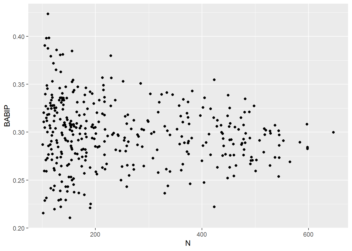
Now we have an idea of what this distribution looks like. But we need a way to see how much control a pitcher has on this number.
Some ideas:
For each pitcher, split data randomly into two groups, compare BABIP in each group.
For each pitcher, split data in first/second half of season, compare BABIP in each group.
See if there’s any correlation between pitch speed and BABIP. This would assume faster pitches are hard to hit. Same argument could be made for pitches that break a lot.
Find quality of each pitch by seeing how often it gets a swinging strike vs a homerun, then see if BABIP is related to the pitch quality.
Fit a logistic model to predict hit/out using pitch speed, location, break, to see if there are types of pitches that lead to outs more often.
1. Randomly split at bats for each pitcher
I’ll split each ball in play for each pitcher into two random groups. Then we’ll compare the BABIP in each group.
d2 %>% mutate(group12=sample(1:2,n(), T)) %>% group_by(pitcher_name, group12) %>% summarize(ipo=sum(event %in% inplayouts), iph=sum(event %in% inplayhits), N=iph+ipo, BABIP=iph/(iph+ipo)) %>% filter(!is.na(pitcher_name)) %>% group_by(pitcher_name) %>% summarize(BABIP1=BABIP[1], BABIP2=BABIP[2], N1=N[1], N2=N[2], N=N1+N2) %>% filter(N1>80 & N2>80) %>% {ggplot(., aes(BABIP1, BABIP2)) + geom_point(aes(color=N1+N2)) + geom_smooth()}## `geom_smooth()` using method = 'loess' and formula 'y ~ x'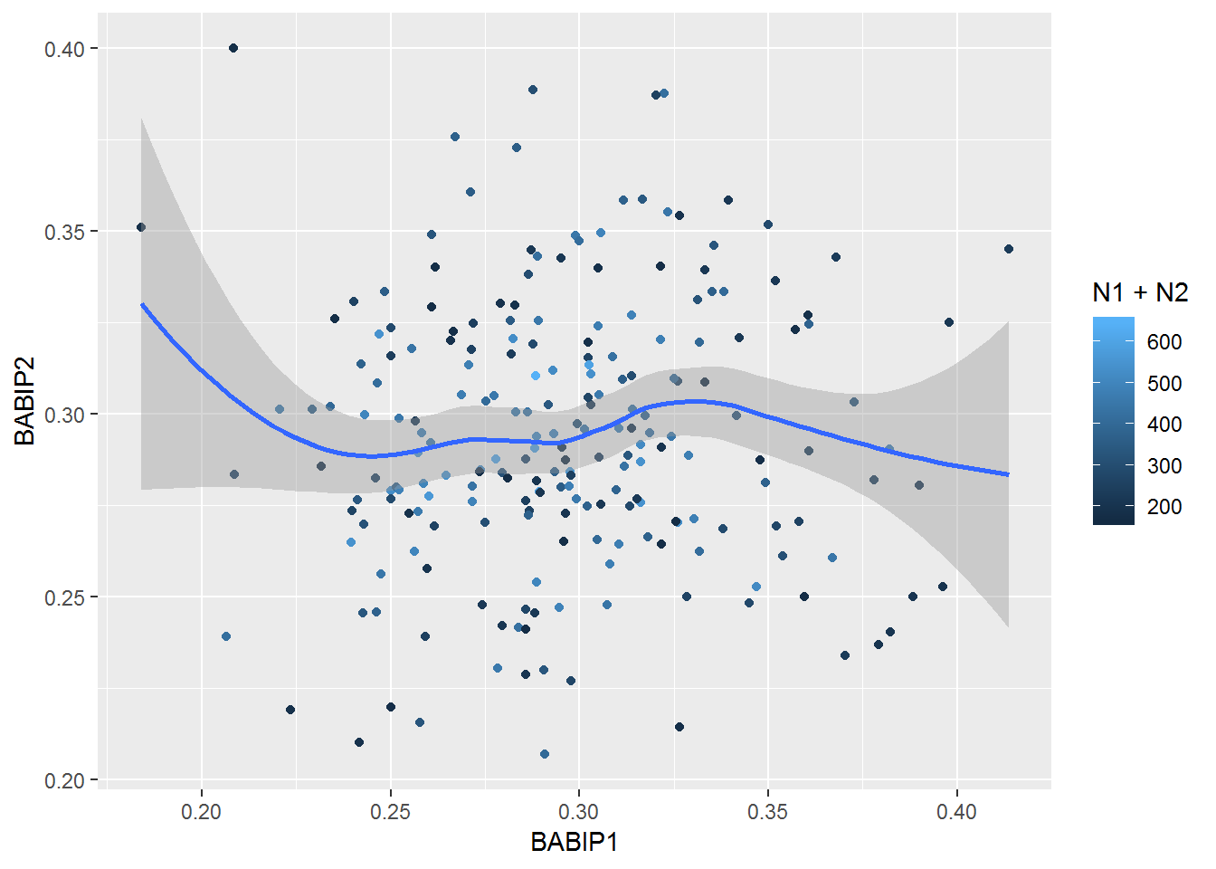
There appears to be no correlation. The correlation coefficient is about 0.04.
d2 %>% mutate(group12=sample(1:2,n(), T)) %>% group_by(pitcher_name, group12) %>% summarize(ipo=sum(event %in% inplayouts), iph=sum(event %in% inplayhits), N=iph+ipo, BABIP=iph/(iph+ipo)) %>% filter(!is.na(pitcher_name)) %>% group_by(pitcher_name) %>% summarize(BABIP1=BABIP[1], BABIP2=BABIP[2], N1=N[1], N2=N[2], N=N1+N2) %>% filter(N1>80 & N2>80) %>% {cor(.$BABIP1, .$BABIP2)}## [1] 0.03165568It would be nice to see what this would look like comparing another quantity, such as percentage of balls put in play.
d2 %>% mutate(group12=sample(1:2,n(), T)) %>% group_by(pitcher_name, group12) %>% summarize(inplay=sum(event %in% c(inplayhits, inplayouts)), notinplay=sum(!(event %in% c(inplayouts, inplayhits))), N=inplay+notinplay, InPlayPer=inplay/(inplay+notinplay)) %>% filter(!is.na(pitcher_name)) %>% group_by(pitcher_name) %>% summarize(InPlayPer1=InPlayPer[1], InPlayPer2=InPlayPer[2], N1=N[1], N2=N[2], N=N1+N2) %>% filter(N1>80 & N2>80) %>% {ggplot(., aes(InPlayPer1, InPlayPer2)) + geom_point(aes(color=N1+N2)) + geom_smooth() + geom_text(aes(label=ifelse(N1+N2>850, pitcher_name, '')))}## `geom_smooth()` using method = 'loess' and formula 'y ~ x'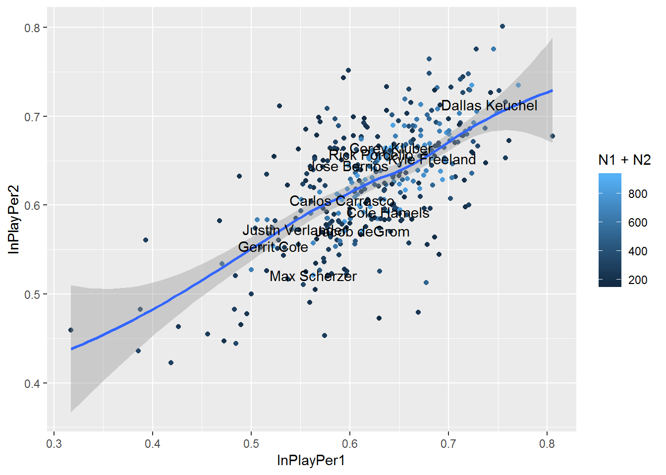
We see from the play that there is decent correlation between the two groups. The correlation coefficient is .61, which is significant.
d2 %>% mutate(group12=sample(1:2,n(), T)) %>% group_by(pitcher_name, group12) %>% summarize(inplay=sum(event %in% c(inplayhits, inplayouts)), notinplay=sum(!(event %in% c(inplayouts, inplayhits))), N=inplay+notinplay, InPlayPer=inplay/(inplay+notinplay)) %>% filter(!is.na(pitcher_name)) %>% group_by(pitcher_name) %>% summarize(InPlayPer1=InPlayPer[1], InPlayPer2=InPlayPer[2], N1=N[1], N2=N[2], N=N1+N2) %>% filter(N1>80 & N2>80) %>% {cor(.$InPlayPer1, .$InPlayPer2)}## [1] 0.66272112. Split up each pitchers results by the two halves of the season
I’ll do the same as before, but now assign groups so the first half of the pitchers in play balls are in one group, the rest in the other.
d2 %>% group_by(pitcher_name) %>% mutate(group12=rep(c(1,2), c(floor(n()/2),n()-floor(n()/2)))) %>% ungroup %>% group_by(pitcher_name, group12) %>% summarize(ipo=sum(event %in% inplayouts), iph=sum(event %in% inplayhits), N=iph+ipo, BABIP=iph/(iph+ipo)) %>% filter(!is.na(pitcher_name)) %>% group_by(pitcher_name) %>% summarize(BABIP1=BABIP[1], BABIP2=BABIP[2], N1=N[1], N2=N[2], N=N1+N2) %>% filter(N1>80 & N2>80) %>% {ggplot(., aes(BABIP1, BABIP2)) + geom_point(aes(color=N1+N2)) + geom_smooth()}## `geom_smooth()` using method = 'loess' and formula 'y ~ x'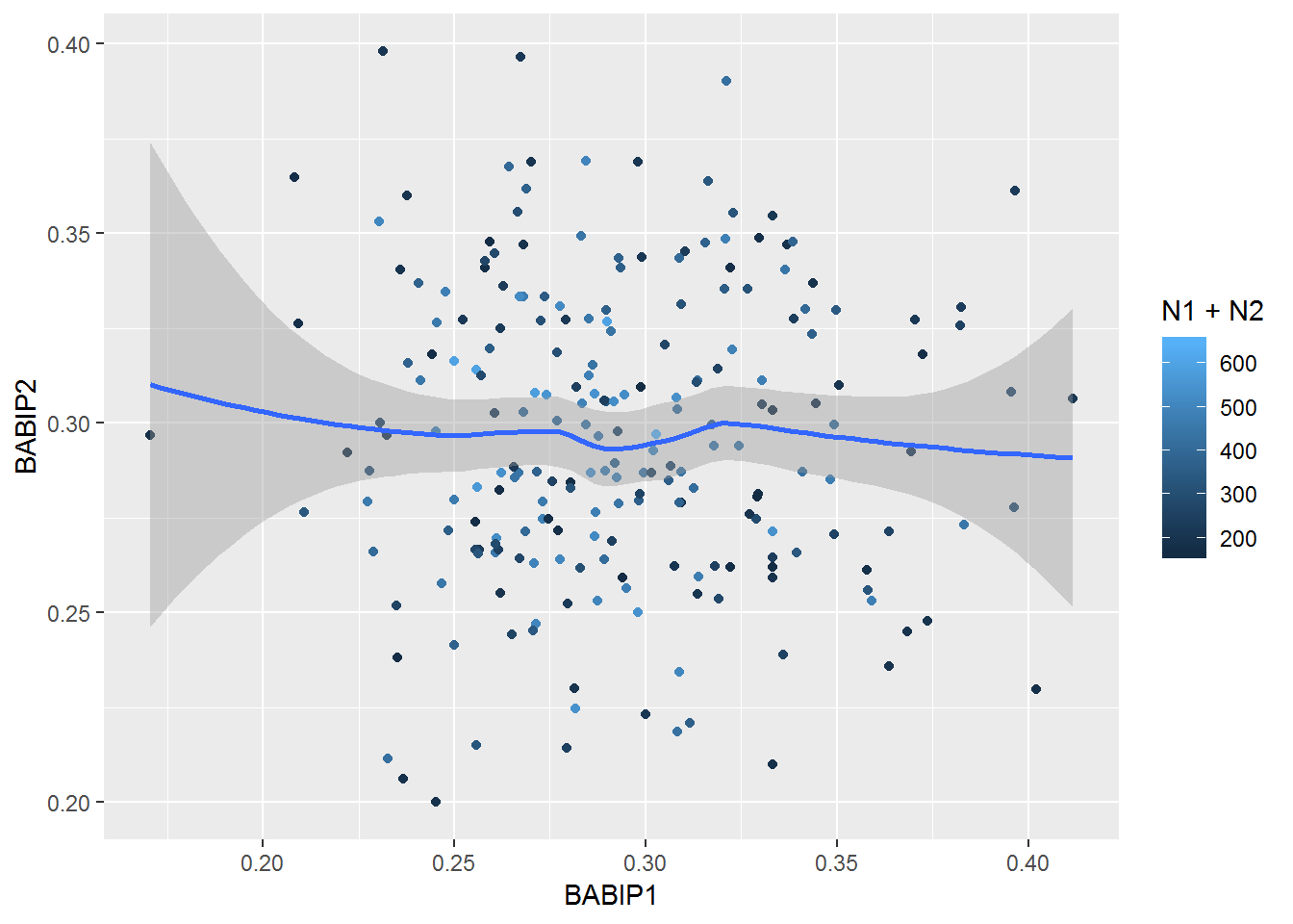
Again, no clear pattern, and a correlation coefficient near zero.
d2 %>% group_by(pitcher_name) %>% mutate(group12=rep(c(1,2), c(floor(n()/2),n()-floor(n()/2)))) %>% ungroup %>% group_by(pitcher_name, group12) %>% summarize(ipo=sum(event %in% inplayouts), iph=sum(event %in% inplayhits), N=iph+ipo, BABIP=iph/(iph+ipo)) %>% filter(!is.na(pitcher_name)) %>% group_by(pitcher_name) %>% summarize(BABIP1=BABIP[1], BABIP2=BABIP[2], N1=N[1], N2=N[2], N=N1+N2) %>% filter(N1>80 & N2>80) %>% with(cor(BABIP1, BABIP2))## [1] -0.02318874Let’s check proportion of balls put in play as before, but with this new grouping method.
d2 %>% group_by(pitcher_name) %>% mutate(group12=rep(c(1,2), c(floor(n()/2),n()-floor(n()/2)))) %>% ungroup %>% group_by(pitcher_name, group12) %>% summarize(inplay=sum(event %in% c(inplayhits, inplayouts)), notinplay=sum(!(event %in% c(inplayouts, inplayhits))), N=inplay+notinplay, InPlayPer=inplay/(inplay+notinplay)) %>% filter(!is.na(pitcher_name)) %>% group_by(pitcher_name) %>% summarize(InPlayPer1=InPlayPer[1], InPlayPer2=InPlayPer[2], N1=N[1], N2=N[2], N=N1+N2) %>% filter(N1>80 & N2>80) %>% {ggplot(., aes(InPlayPer1, InPlayPer2)) + geom_point(aes(color=N1+N2)) + geom_smooth() + geom_text(aes(label=ifelse(N1+N2>850, pitcher_name, '')))}## `geom_smooth()` using method = 'loess' and formula 'y ~ x'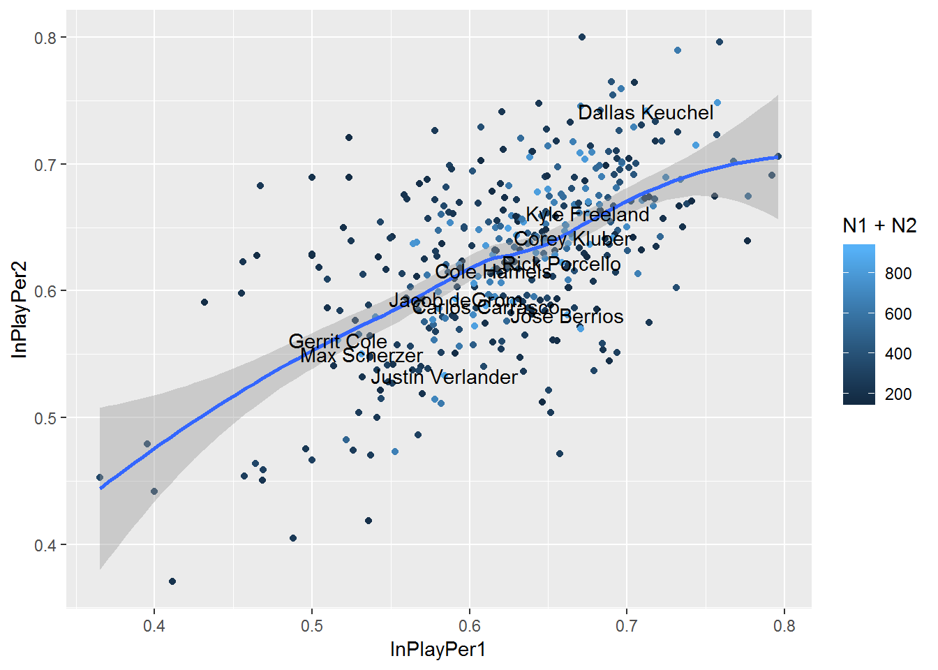
Again, there is a pattern with .59 correlation coefficient.
d2 %>% group_by(pitcher_name) %>% mutate(group12=rep(c(1,2), c(floor(n()/2),n()-floor(n()/2)))) %>% ungroup %>% group_by(pitcher_name, group12) %>% summarize(inplay=sum(event %in% c(inplayhits, inplayouts)), notinplay=sum(!(event %in% c(inplayouts, inplayhits))), N=inplay+notinplay, InPlayPer=inplay/(inplay+notinplay)) %>% filter(!is.na(pitcher_name)) %>% group_by(pitcher_name) %>% summarize(InPlayPer1=InPlayPer[1], InPlayPer2=InPlayPer[2], N1=N[1], N2=N[2], N=N1+N2) %>% filter(N1>80 & N2>80) %>% {cor(.$InPlayPer1, .$InPlayPer2)}## [1] 0.5909042I’m going to skip 3 and 4 and go to 5. Those seem like too much work.
5. Logistic regression to predict if ball in play is hit or out
We’re going to need to decide which features to include in the model. I worked backwards and removed all the ones I don’t want, so it’s a mess of code below. Basically I want to keep the location, speed, and spin data.
d2 %>% select(-c(gameday_link.x, gameday_link.y, end_tfs_zulu, event_num.x, event_num.y, event_es, event_es, event2_es, date, event4, pitcher_name, batter_name, event3, event2, next_.y, inning.y, inning_side.y, inning.x, inning_side.x, away_team_runs, home_team_runs, url, des, des_es, atbat_des, atbat_des_es, p_throws, b_height, stand, start_tfs, start_tfs_zulu, pitcher, batter, play_guid, code, count, on_3b, on_2b, on_1b, num, next_.x, type_confidence, id, type, x, y, o, cc, mt, tfs, tfs_zulu, sz_top, sz_bot, x0, y0, z0, vx0, vy0, vz0, sv_id, b, s)) %>% filter(event %in% c(inplayhits, inplayouts)) %>% mutate(iph=ifelse(event %in% inplayhits, 1, 0)) %>% with(iph) %>% table## .
## 0 1
## 83667 35595# data in play
dip <- d2 %>% select(-c(gameday_link.x, gameday_link.y, end_tfs_zulu, event_num.x, event_num.y, event_es, event_es, event2_es, date, event4, pitcher_name, batter_name, event3, event2, next_.y, inning.y, inning_side.y, inning.x, inning_side.x, away_team_runs, home_team_runs, url, des, des_es, atbat_des, atbat_des_es, p_throws, b_height, stand, start_tfs, start_tfs_zulu, pitcher, batter, play_guid, code, count, on_3b, on_2b, on_1b, num, next_.x, type_confidence, id, type, x, y, o, cc, mt, tfs, tfs_zulu, sz_top, sz_bot, x0, y0, z0, vx0, vy0, vz0, sv_id, b, s)) %>% filter(event %in% c(inplayhits, inplayouts)) %>% mutate(iph=ifelse(event %in% inplayhits, 1, 0)) %>% select(-event)I’m going to randomly assign the training and testing.
train_inds <- sample(1:nrow(dip), floor(.7*nrow(dip)), T)
dip_train <- dip[train_inds,]
dip_test  <- dip[-train_inds,]
First I’ll fit a simpler logistc regression model that only uses three of the factors.
mod1 <- glm(iph ~ start_speed + spin_rate + break_length, "binomial", dip_train)
pred1train <- plogis(predict(mod1, dip_train))
qplot(pred1train, dip_train$iph+rnorm(nrow(dip_train), 0, .04), alpha=.0001)
## Warning: Removed 782 rows containing missing values (geom_point).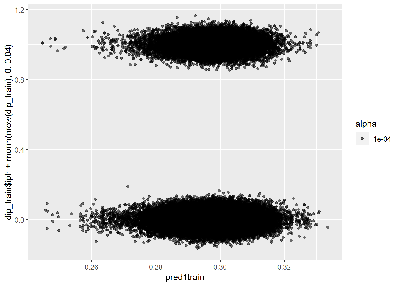
pred1test <- plogis(predict(mod1, dip_test))
qplot(pred1test, dip_test$iph+rnorm(nrow(dip_test), 0, .02))
## Warning: Removed 586 rows containing missing values (geom_point).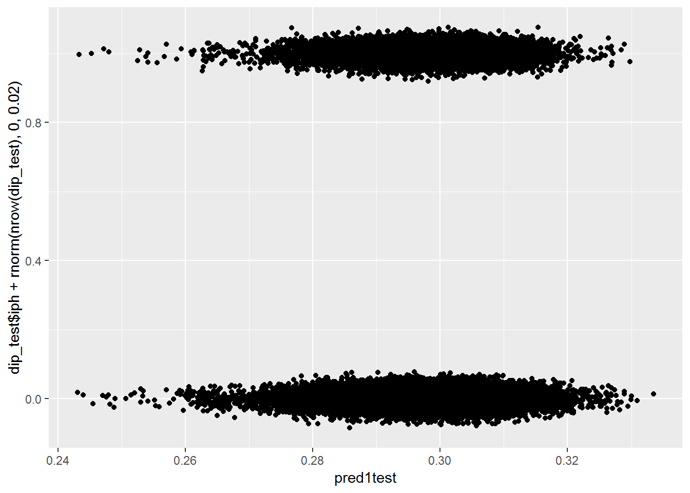
dip_train %>% mutate(p1 = pred1train, iphf=as.factor(iph)) %>% {ggplot(data=., mapping=aes(x=p1, group=iphf, fill=iphf)) + geom_histogram(alpha=.6)}## `stat_bin()` using `bins = 30`. Pick better value with `binwidth`.## Warning: Removed 782 rows containing non-finite values (stat_bin).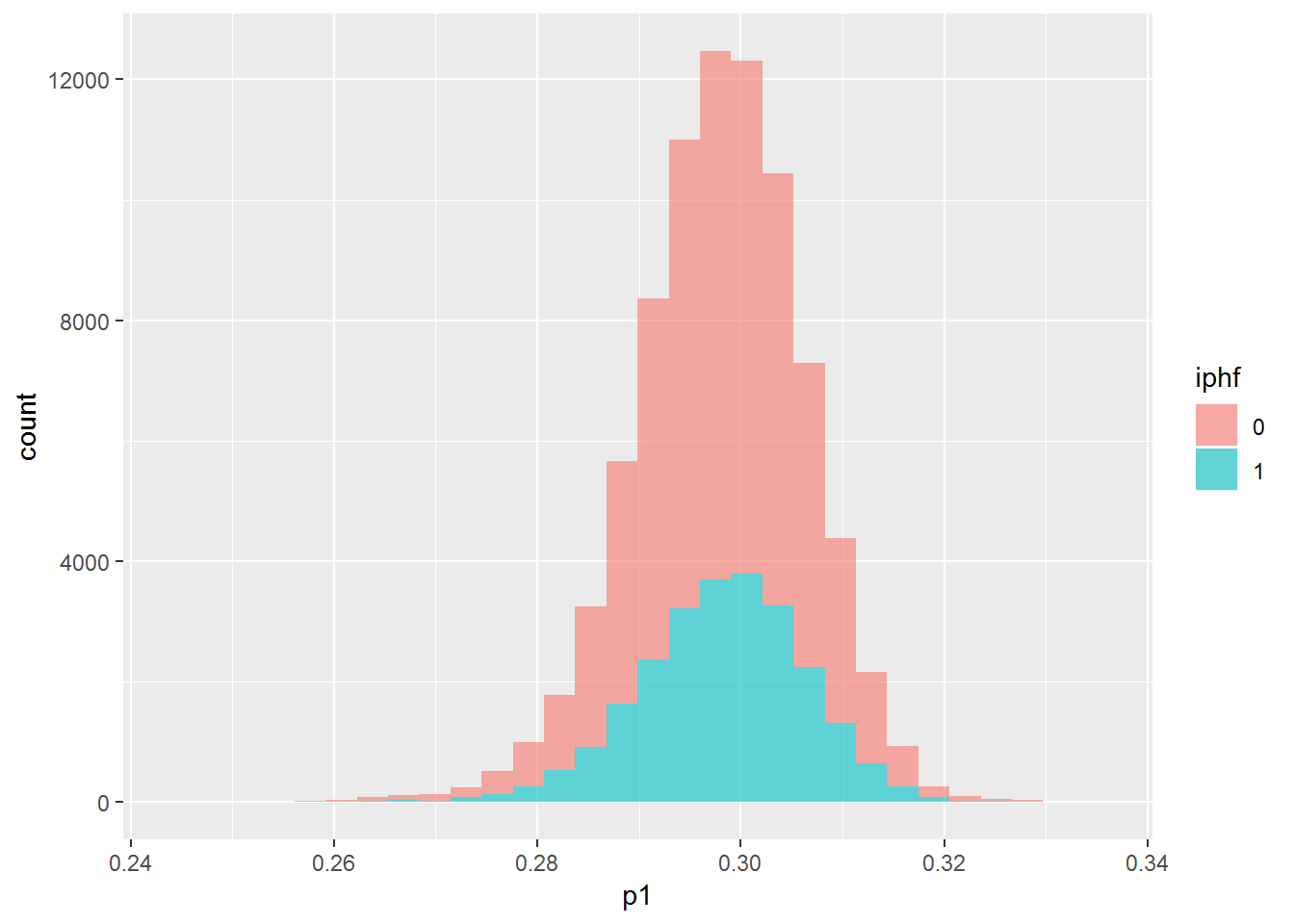
dip_test %>% mutate(p1 = pred1test, iphf=as.factor(iph)) %>% {ggplot(data=., mapping=aes(x=p1, group=iphf, fill=iphf)) + geom_histogram(alpha=.6)}## `stat_bin()` using `bins = 30`. Pick better value with `binwidth`.## Warning: Removed 586 rows containing non-finite values (stat_bin).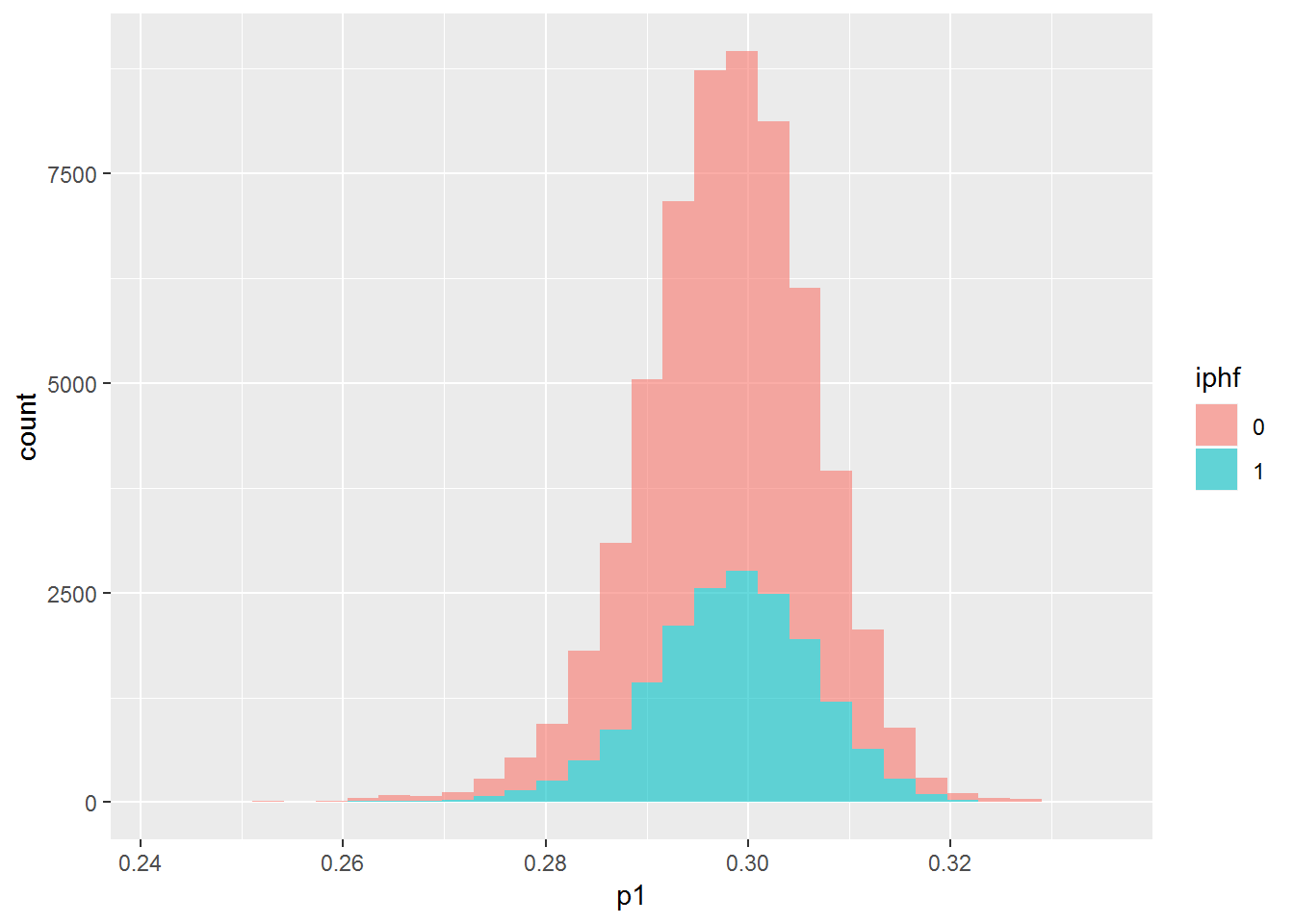
The plots all show that the model is not able to find any difference between the two groups. The first and third plots shows that it can’t even find a difference on the training data, which should be easier than testing data. Let’s try another model with more features.
mod2 <- glm(iph ~ start_speed + spin_rate + break_length + pfx_x + pfx_z + px + pz + break_y + nasty, "binomial", dip_train)
pred1train <- plogis(predict(mod2, dip_train))
qplot(pred1train, dip_train$iph+rnorm(nrow(dip_train), 0, .04), alpha=.0001)
## Warning: Removed 782 rows containing missing values (geom_point).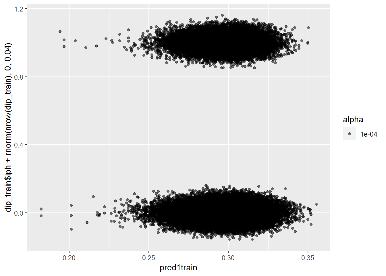
pred1test <- plogis(predict(mod2, dip_test))
qplot(pred1test, dip_test$iph+rnorm(nrow(dip_test), 0, .02))
## Warning: Removed 586 rows containing missing values (geom_point).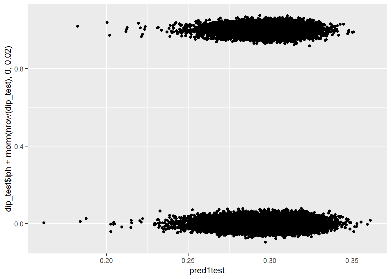
dip_test %>% mutate(p1 = pred1test, iphf=as.factor(iph)) %>% {ggplot(data=., mapping=aes(x=p1, group=iphf, fill=iphf)) + geom_histogram(alpha=.6)}## `stat_bin()` using `bins = 30`. Pick better value with `binwidth`.## Warning: Removed 586 rows containing non-finite values (stat_bin).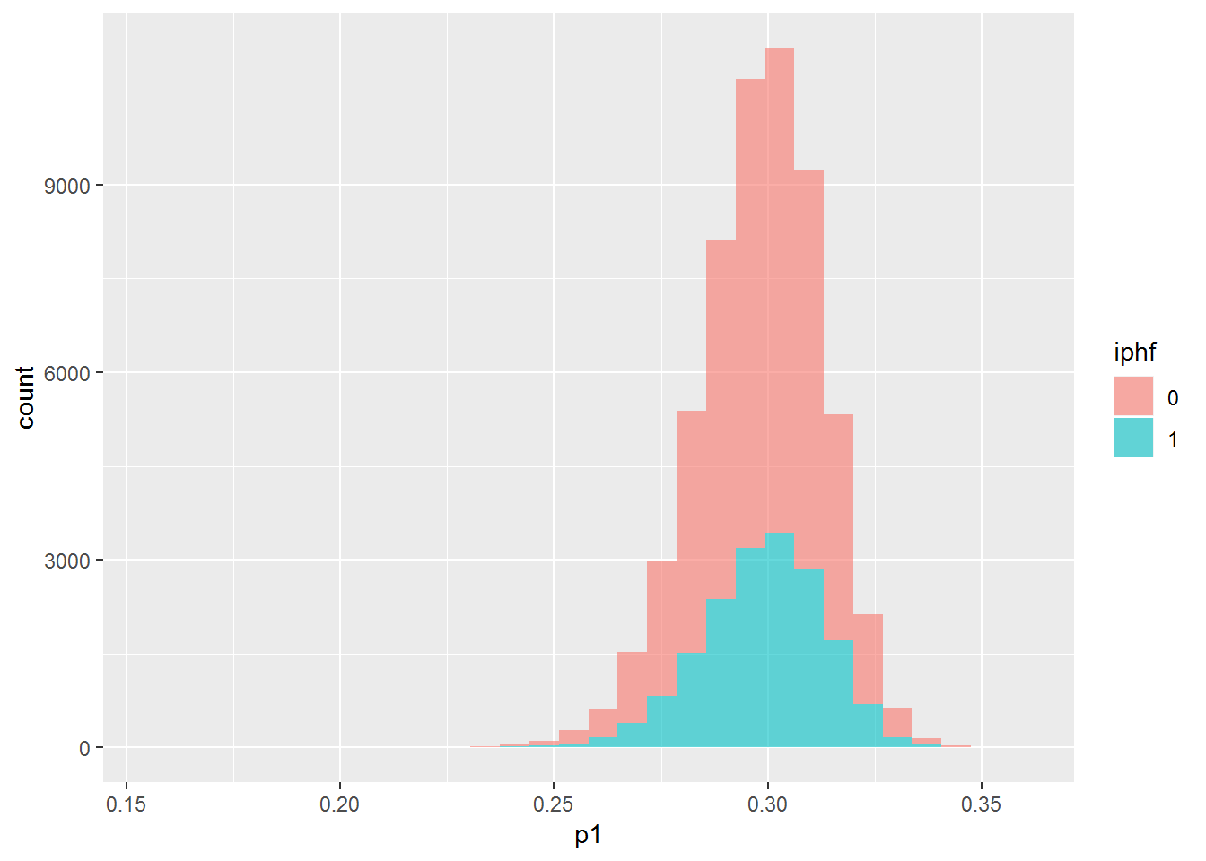
With these additional features, it still can’t really tell the difference between the two groups.
BABIP by zone
I’m curious to see how the zone the pitch is in affects the BABIP.
d2 %>% group_by(zone) %>% summarize(ipo=sum(event %in% inplayouts), iph=sum(event %in% inplayhits), N=iph+ipo, BABIP=iph/(iph+ipo)) %>% filter(N>100) %>% arrange(BABIP)## # A tibble: 14 x 5
## zone ipo iph N BABIP
## <dbl> <int> <int> <int> <dbl>
## 1 11 6024 2211 8235 0.268
## 2 12 5183 1984 7167 0.277
## 3 14 8367 3232 11599 0.279
## 4 1 4204 1627 5831 0.279
## 5 2 4878 1933 6811 0.284
## 6 13 7283 2935 10218 0.287
## 7 3 3716 1604 5320 0.302
## 8 9 6191 2711 8902 0.305
## 9 7 5537 2442 7979 0.306
## 10 NA 790 351 1141 0.308
## 11 4 7557 3386 10943 0.309
## 12 6 7558 3394 10952 0.310
## 13 5 9149 4231 13380 0.316
## 14 8 7230 3554 10784 0.330zones <- data.frame(
zone = (c(rep(1:9, each=4), rep(11:14, each=6))),
x = c(1,2,2,1,2,3,3,2,3,4,4,3,1,2,2,1,2,3,3,2,3,4,4,3,1,2,2,1,2,3,3,2,3,4,4,3, 0,1,1,2.5,2.5,0, 2.5,4,4,5,5,2.5, 2.5,5,5,4,4,2.5, 0,2.5,2.5,1,1,0),
y = c(3,3,4,4,3,3,4,4,3,3,4,4,2,2,3,3,2,2,3,3,2,2,3,3,1,1,2,2,1,1,2,2,1,1,2,2, 2.5,2.5,4,4,5,5, 4,4,2.5,2.5,5,5, 0,0,2.5,2.5,1,1, 0,0,1,1,2.5,2.5)
)
zones$bs <- ifelse(as.numeric(zones$zone) <=9, "S","B")babipzonesdf <- d2 %>% group_by(zone) %>% summarize(ipo=sum(event %in% inplayouts), iph=sum(event %in% inplayhits), N=iph+ipo, BABIP=iph/(iph+ipo)) %>% filter(N>100) %>% arrange(BABIP) %>% inner_join(zones, by="zone")
ggplot(babipzonesdf) + geom_polygon(aes(x=x,y=y,fill=BABIP, group=zone), alpha=.8) + scale_fill_gradientn(colours=c('blue','white','red'))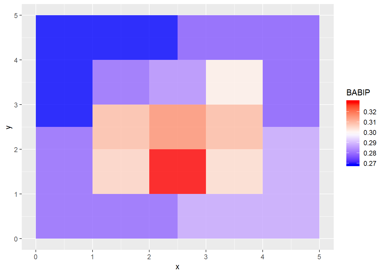
Here we can get something. The BABIP is highest in the lower two thirds of the strike zone, and lowest outside the strike zone. This isn’t too surprising since it’s hard to get contact on pitches outside the zone. But at the same time, this would mean that pitchers can control their BABIP by pitching to specific zones.
BABIP by nasty
Looks like nastiness is not a good predictor of BABIP by itself.
dip %>% {ggplot(data=., mapping=aes(x=nasty, group=iph, fill=iph)) + geom_histogram(alpha=.6)}## `stat_bin()` using `bins = 30`. Pick better value with `binwidth`.## Warning: Removed 1141 rows containing non-finite values (stat_bin).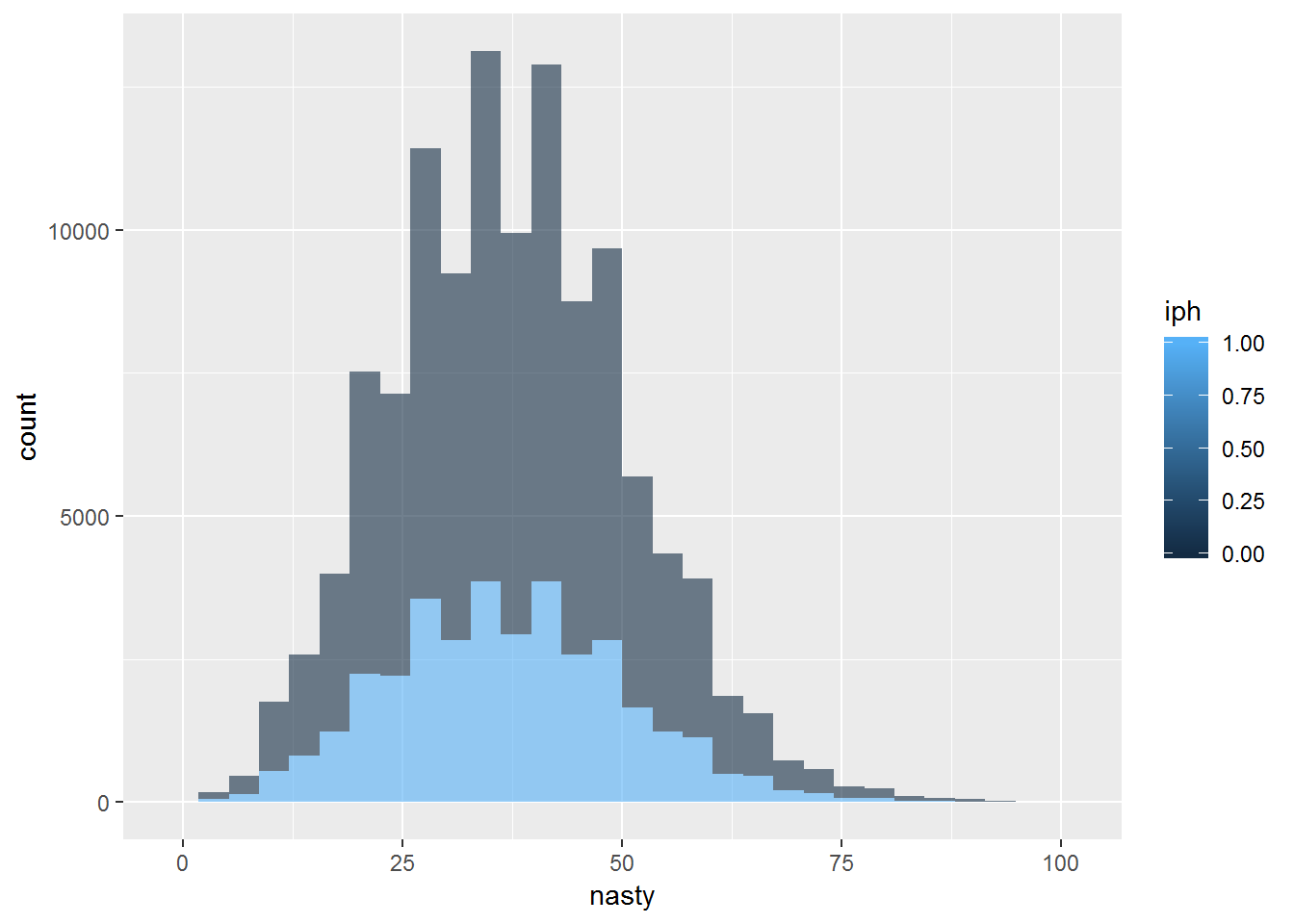
Conclusion
From some basic data exploration here, I’ve become more convinced in the assumption behind FIP/DIPS: that pitchers can’t control the proportion of balls in play that become hits. This means that saying that some pitchers are able to induce weak contact is not really a thing. I could do some exploration on this. The only thing useful I found was that BABIP is lower outside of the strike zone, which makes sense.