I going to work more with data from mlbgameday.
library(mlbgameday)
library(magrittr)
library(ggplot2)
library(dplyr)
##
## Attaching package: 'dplyr'## The following objects are masked from 'package:stats':
##
## filter, lag## The following objects are masked from 'package:base':
##
## intersect, setdiff, setequal, unionGet data.
# Takes hours to get all the data for the year
dat <- get_payload(start = "2018-01-01", end = "2018-12-31")
Get pitcher names from at bat data.
d2 <- inner_join(dat$pitch, dat$atbat, by=c("num", "url"))Pick out the swinging strikes.
d2 %>% filter(des %in% c("Swinging Strike", "Swinging Strike (Blocked)")) %>% group_by(pitcher_name) %>% summarize(N=n()) %>% arrange(desc(N))## # A tibble: 878 x 2
## pitcher_name N
## <chr> <int>
## 1 <NA> 10872
## 2 Max Scherzer 656
## 3 Jacob deGrom 583
## 4 Justin Verlander 563
## 5 Gerrit Cole 544
## 6 Blake Snell 519
## 7 Patrick Corbin 506
## 8 Carlos Carrasco 504
## 9 Chris Sale 472
## 10 Trevor Bauer 461
## # ... with 868 more rowsThese names are the ones we’d expect.
Who has the highest proportion of pitches as swinging strikes?
d2 %>% filter(!is.na(pitcher_name)) %>% group_by(pitcher_name) %>% summarize(N=n(), Nss = sum(des %in% c("Swinging Strike", "Swinging Strike (Blocked)"))) %>% mutate(pSS = Nss / N) %>% arrange(desc(pSS))## # A tibble: 940 x 4
## pitcher_name N Nss pSS
## <chr> <int> <int> <dbl>
## 1 Brandon Brennan 8 6 0.75
## 2 Ben Rowen 11 8 0.727
## 3 Brady Feigl 9 6 0.667
## 4 Joe Mantiply 9 6 0.667
## 5 Andrew Schwaab 15 9 0.6
## 6 Nick Pasquale 5 3 0.6
## 7 Domingo Tapia 12 7 0.583
## 8 Cesar Vargas 18 9 0.5
## 9 Joe Gunkel 6 3 0.5
## 10 Malcom Culver 44 22 0.5
## # ... with 930 more rowsUnsurprisingly these are only guys with few pitches. Lets only pick out pitchers with at least 300 pitches.
d2 %>% filter(!is.na(pitcher_name)) %>% group_by(pitcher_name) %>% summarize(N=n(), Nss = sum(des %in% c("Swinging Strike", "Swinging Strike (Blocked)"))) %>% mutate(pSS = Nss / N) %>% arrange(desc(pSS)) %>% filter(N >= 300)## # A tibble: 505 x 4
## pitcher_name N Nss pSS
## <chr> <int> <int> <dbl>
## 1 Josh Hader 1575 325 0.206
## 2 Hector Neris 853 176 0.206
## 3 Marcus Walden 317 65 0.205
## 4 Edwin Diaz 1266 245 0.194
## 5 Sean Doolittle 735 141 0.192
## 6 Dominic Leone 485 93 0.192
## 7 Ryan Pressly 1300 244 0.188
## 8 Jose Leclerc 1035 190 0.184
## 9 Joshua Lucas 316 57 0.180
## 10 Carson Smith 339 61 0.180
## # ... with 495 more rowsThe pitchers best at missing bats are Josh Hader, Hector Neris, and Marcus Walden. Unsurprisingly these are all relievers.
If we set a higher bar for N, we can see the best starting pitchers.
d2 %>% filter(!is.na(pitcher_name)) %>% group_by(pitcher_name) %>% summarize(N=n(), Nss = sum(des %in% c("Swinging Strike", "Swinging Strike (Blocked)"))) %>% mutate(pSS = Nss / N) %>% arrange(desc(pSS)) %>% filter(N >= 2000)## # A tibble: 116 x 4
## pitcher_name N Nss pSS
## <chr> <int> <int> <dbl>
## 1 Max Scherzer 3728 656 0.176
## 2 Blake Snell 3104 519 0.167
## 3 Jacob deGrom 3634 583 0.160
## 4 Chris Sale 2944 472 0.160
## 5 Patrick Corbin 3252 506 0.156
## 6 Carlos Carrasco 3249 504 0.155
## 7 Masahiro Tanaka 2811 429 0.153
## 8 Gerrit Cole 3651 544 0.149
## 9 Jack Flaherty 2730 406 0.149
## 10 James Paxton 2738 404 0.148
## # ... with 106 more rowsLet’s plot SS rate by pitcher and plot N vs Nss. This is a nasty plot. I put both axes on logs, used colors to show the best/worse pSS, and tried to add names.
d2 %>% filter(!is.na(pitcher_name)) %>% group_by(pitcher_name) %>% summarize(N=n(), Nss = sum(des %in% c("Swinging Strike", "Swinging Strike (Blocked)"))) %>% mutate(pSS = Nss / N) %>% arrange(desc(pSS)) %>% filter(Nss>0, N>1000) %>%
  {(ggplot(., mapping=aes(N, Nss, color=pSS)) + geom_point() + geom_text(aes(label=ifelse(pSS>.2 | pSS<.07 | Nss>500 | N > 4e3, pitcher_name, ''))) + scale_color_gradientn(colors=c("blue", "black", "red")) )}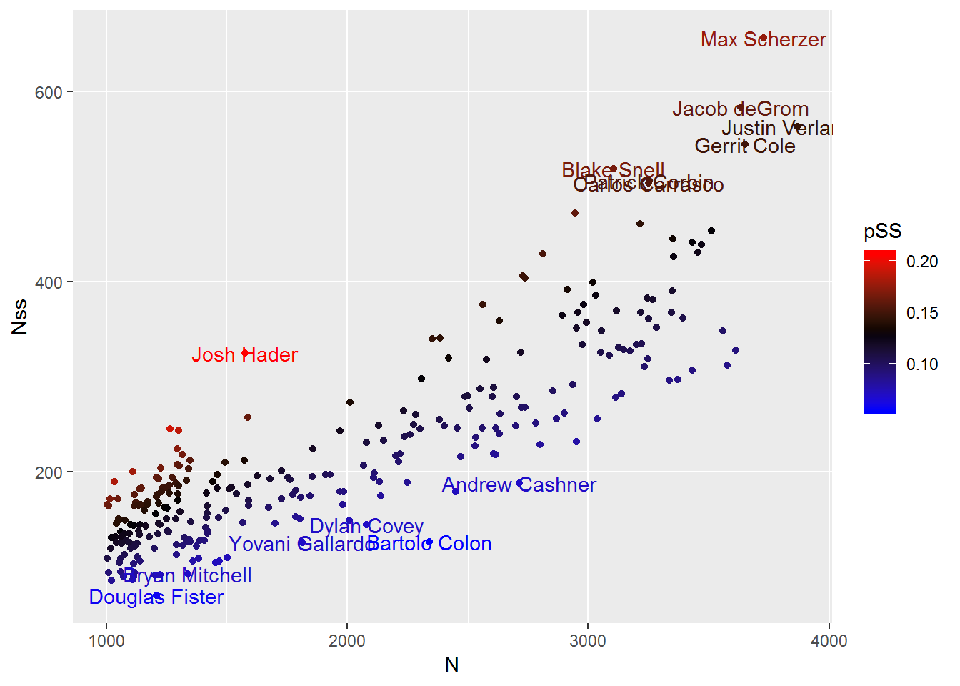
Where do swings and misses happen?
d2 %>% group_by(zone) %>% summarize(N=n(), Nss = sum(des %in% c("Swinging Strike", "Swinging Strike (Blocked)"))) %>% mutate(pSS = Nss / N) %>% arrange(desc(pSS))## # A tibble: 14 x 4
## zone N Nss pSS
## <dbl> <int> <int> <dbl>
## 1 NA 67971 15501 0.228
## 2 14 160260 22099 0.138
## 3 2 28565 3725 0.130
## 4 3 24008 2990 0.125
## 5 13 118329 14257 0.120
## 6 1 25380 3010 0.119
## 7 9 34948 4035 0.115
## 8 8 36803 3801 0.103
## 9 7 31026 3096 0.0998
## 10 12 75601 6656 0.0880
## 11 6 37556 3239 0.0862
## 12 5 41701 3367 0.0807
## 13 11 94465 7238 0.0766
## 14 4 36096 2658 0.0736We have a lot of pitches with zone NA, so we’ll need to exclude these. I’m going to use the zones I created last time to plot these.
zone_values <- data.frame()
zones <- data.frame(
  zone = (c(rep(1:9, each=4), rep(11:14, each=6))),
  x = c(1,2,2,1,2,3,3,2,3,4,4,3,1,2,2,1,2,3,3,2,3,4,4,3,1,2,2,1,2,3,3,2,3,4,4,3,  0,1,1,2.5,2.5,0, 2.5,4,4,5,5,2.5, 2.5,5,5,4,4,2.5, 0,2.5,2.5,1,1,0),
  y = c(3,3,4,4,3,3,4,4,3,3,4,4,2,2,3,3,2,2,3,3,2,2,3,3,1,1,2,2,1,1,2,2,1,1,2,2,  2.5,2.5,4,4,5,5, 4,4,2.5,2.5,5,5, 0,0,2.5,2.5,1,1, 0,0,1,1,2.5,2.5)
)
zones$bs <- ifelse(as.numeric(zones$zone) <=9, "S","B")
ggplot() + geom_polygon(aes(x=x,y=y,fill=as.factor(bs), group=zone), zones, alpha=.5)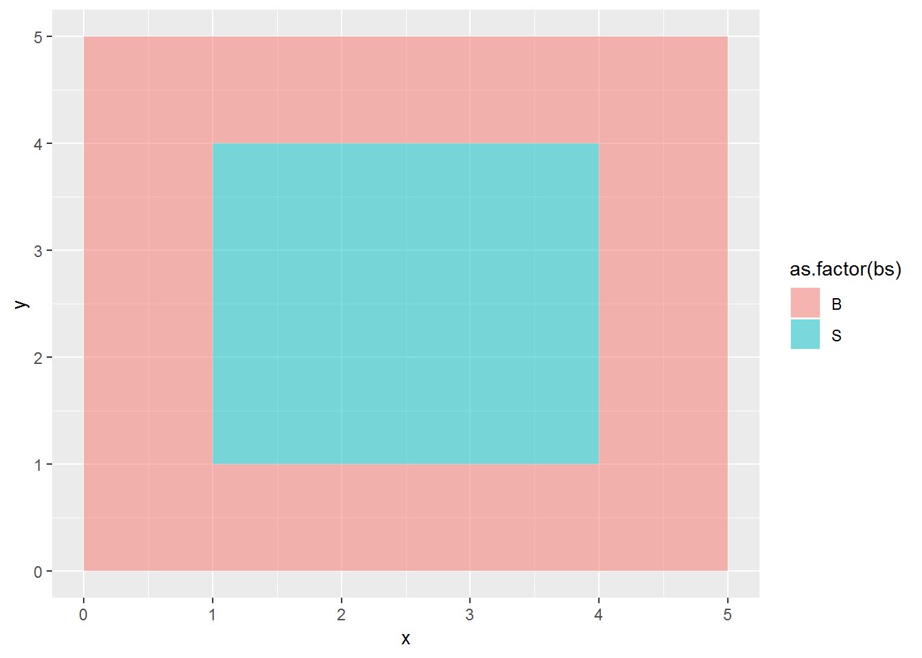
Now we can plot the swinging strike rates by zone.
SSdf <- d2 %>% group_by(zone) %>% summarize(N=n(), Nss = sum(des %in% c("Swinging Strike", "Swinging Strike (Blocked)"))) %>% mutate(pSS = Nss / N) %>% arrange(desc(pSS)) %>% filter(!is.na(zone)) %>% inner_join(zones)## Joining, by = "zone"ggplot(SSdf) + geom_polygon(aes(x=x,y=y,fill=pSS, group=zone), alpha=.8) + scale_fill_gradientn(colours=c('blue','white','red'))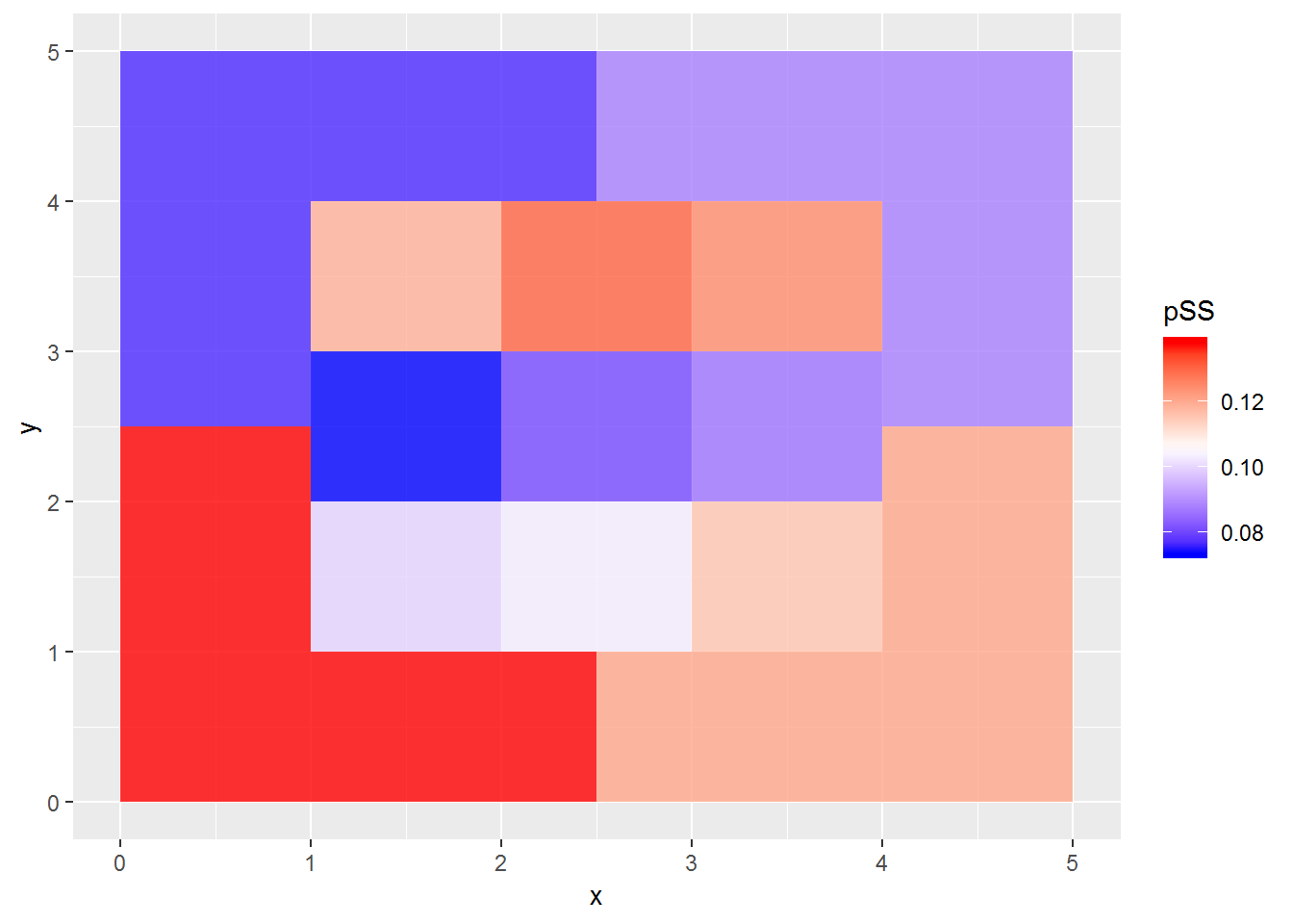
Again the results aren’t too surprising. Swings and misses occur most on low pitches outside the strike zone. If they were in the strike zone, they would be more likely to make contact. The lowest swinging strike rate is right in the center of the strike zone, which should be the easiest place to make contact.
So far we’ve been looking at the rate of swings and misses as a proportion of all pitches. What if we just look at pitches the batters swung at? We’ll have swings and misses on one hand, and contact on the other. In other words, given that the batter swung, what is the proportion that were misses?
SSdf2 <- d2 %>% group_by(zone) %>% summarize(N=n(), Ncontact=sum(des %in% c("Foul", "Foul (Runner Going)", "Foul Bunt", "Foul Tip", "In play, no out", "In play, out(s)", "In play, run(s)")), Nss = sum(des %in% c("Swinging Strike", "Swinging Strike (Blocked)"))) %>% mutate(pSSwung = Nss / (Nss + Ncontact)) %>% filter(!is.na(zone)) %>% inner_join(zones, by="zone")
ggplot(SSdf2) + geom_polygon(aes(x=x,y=y,fill=pSSwung, group=zone), alpha=.8) + scale_fill_gradientn(colours=c('blue','white','red'))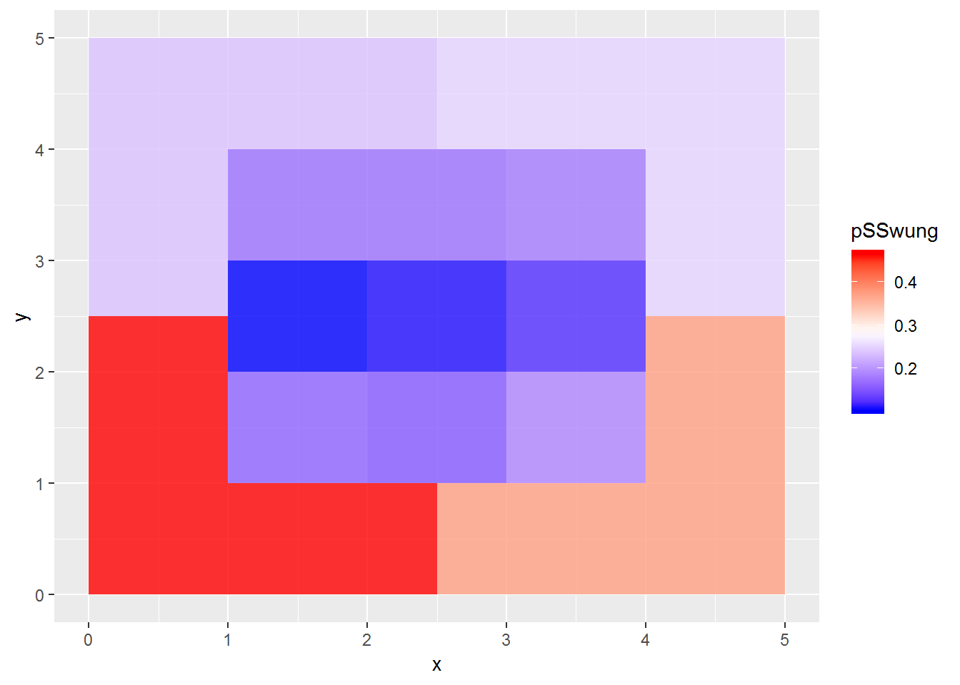 It’s highest below the strike zone, lowest in the center row of the strike zone.
Similar trend as when looking at swinging strikes as a proportion of all pitches.
It’s highest below the strike zone, lowest in the center row of the strike zone.
Similar trend as when looking at swinging strikes as a proportion of all pitches.